

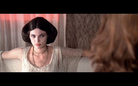
Suspiria is a pretty crap movie, in terms of characterisation, logic and plot – but what the 1977 ballet-school gore fest lacks in typical filmic value it makes up for in great production design, cinematography and all out seventies-style popcorn horror.
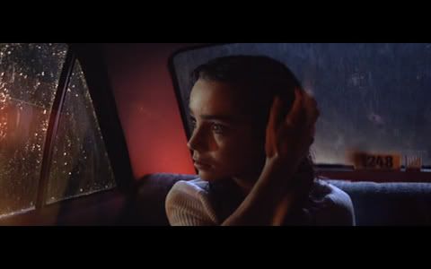
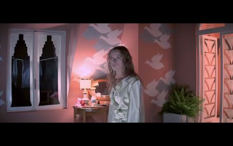
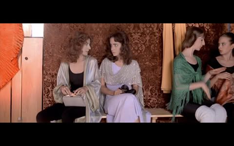
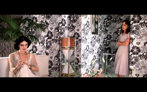
Italian director Dario Argento disregards what makes rational sense for a hallucinatory journey that works on a visual and visceral level…and maybe that’s where horror films work best, after all. The bravery of the visual imagery is what keeps the movie fresh and inspiring today: tender shades of pink and pastel blue with a dramatic art deco spin clash with deep false reds and blacks and an over-the-top lighting design for a mood that’s surreal, disorienting and sometimes delightfully pretty.
The unmistakable visual quality also comes down to the technology - the use of anamorphic lenses and imbibition Technicolor prints, which according to the fount of all knowledge, give the colours a uniquely vivid and saturated look. In short, the visual design is perfect for a gory, kitschy occult thriller featuring genuinely creepy moments and some of the worst fake blood ever.
But you don’t want to hear me talking about it all day, check out the stills:


Edit: I give 12% credit for this post to M Seth Jones, who introduced me to its awesomeness.

 Writer, editor, coffee drinker.


No comments:
Post a Comment